The Optimum Rebranding
PREMIUM BRANDING FOR A PREMIUM BRAND
From the core ideas through the logo and the branding to the website. Everything was so outdated that we needed to throw it away and reimagine it all over again.
- UX / UI
- Design
- Development
- marketing
- tracking
- QA
- Optimization
The Story
THE KING IS OUT OF STYLE
Optimum was already a leader on the Australian market and the most loved appliances brand in the country offering much higher quality products than all competitors and at lower prices due to the genious business model behind the brand. They were the uncrowned kings of the market and already growing across continents. But their branding was done in a hurry by a freelancer from India for less than the box of their average product. To put it lightly the king was dressed in drapes. It was high time to call the tailors and design something worthy of the crown.
Defining Features
- The design of the products was really a really important characteristic of the brand. They look so premium that people often have a special place for them. We had to focus on that.
- Removing the cheap plastics and replacing them with durable high quality metals gave the products their place in the market. Leading us to the metallic color scheme.
- Finally the handmade craftsmanship added as a final touch for each product was represented in the branding through the custom optimum script font.
The Goals
- We were not starting from scratch. We had to represent the defining features of an already loved and respected brand.
- The design had to add additional value to the products and make customers see the premium quality they are built with. Driving customer satisfaction and sales way up.
- The products had to look good enough for people to make a special place in their kitchen for them. So that all guests would see them, ask about them and buy one for themselves.
The Impact
As the saying goes looks are only half the picture. But when the looks are the missing part this translates to half the sales being potentially lost. And it is incredible how the rebranding of optimum increased their organic sales. Their products started to be perceived as much higher quality immediately after. Purchase hesitation decreased dramatically. Most of the customers are women and we all know how when you buy them a car the first thing they ask about it is what color is it? For Optimum that translated to “How is this going to look in my kitchen?”. When the answer in their head was “GREAT!”. They did not hesitate to buy one.
The Website
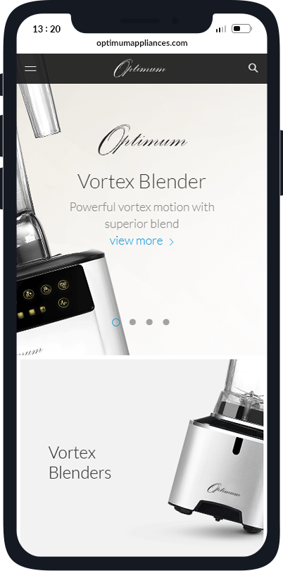
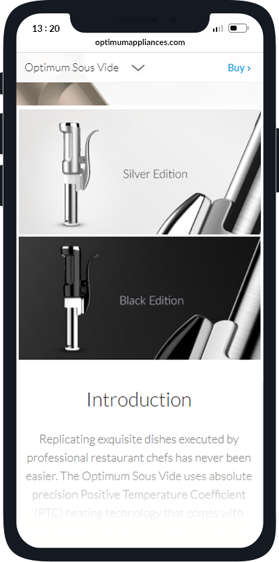
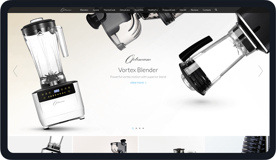
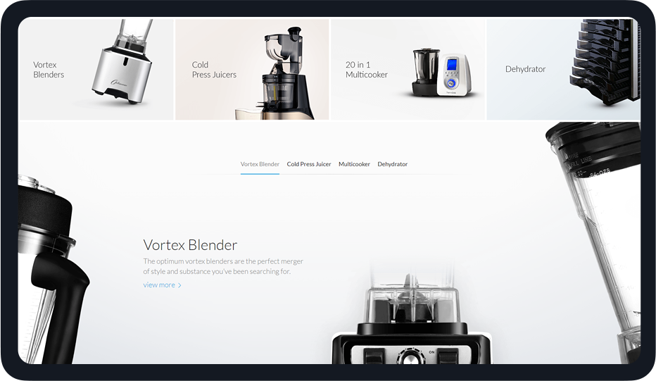
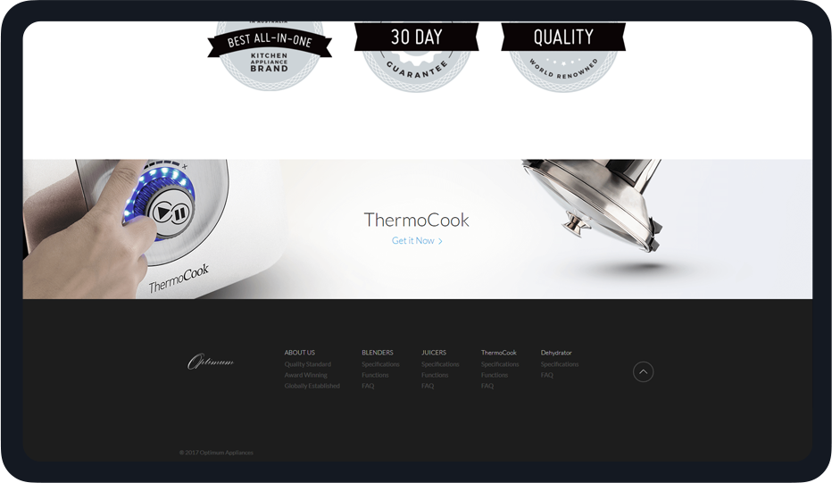
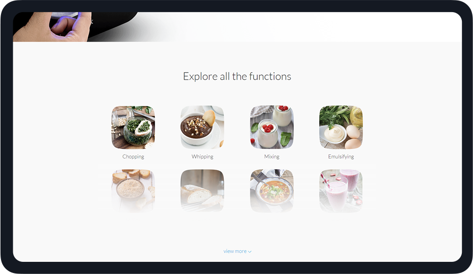
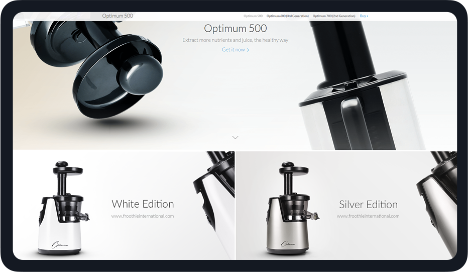
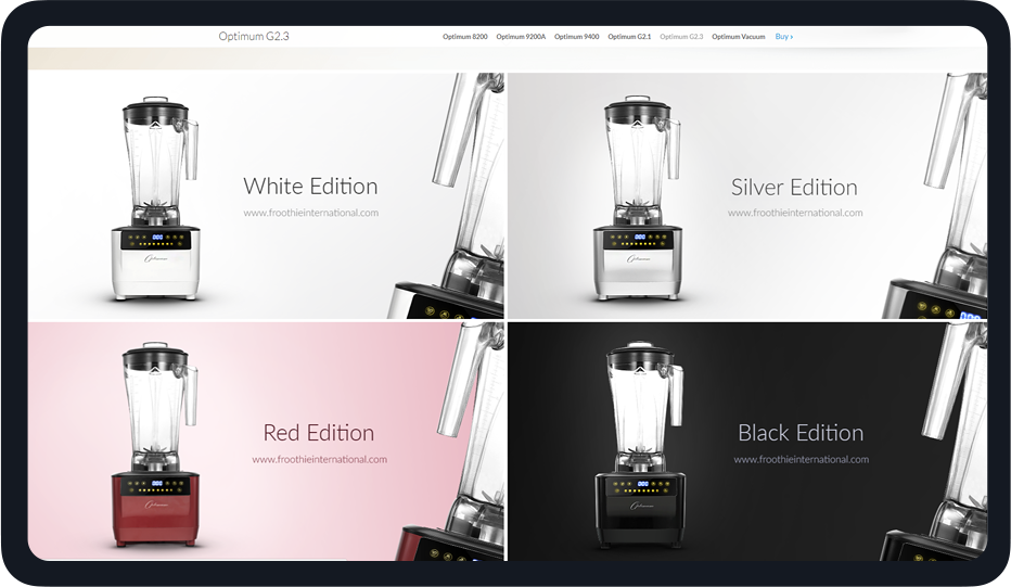
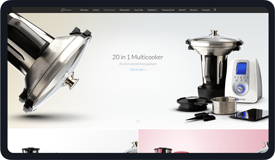
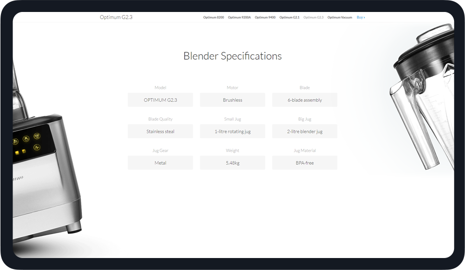
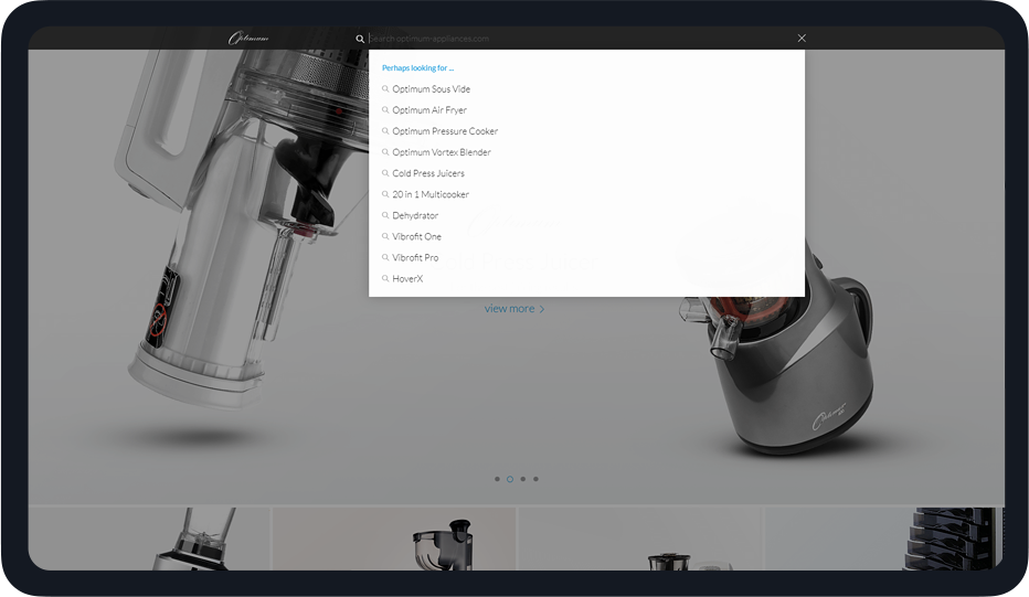
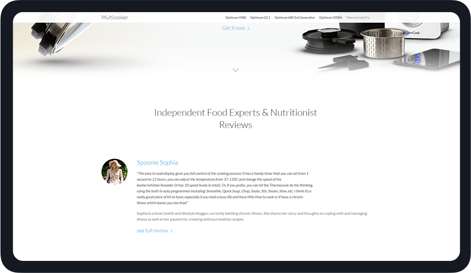
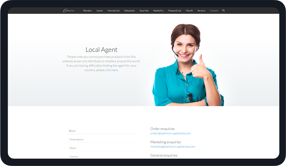
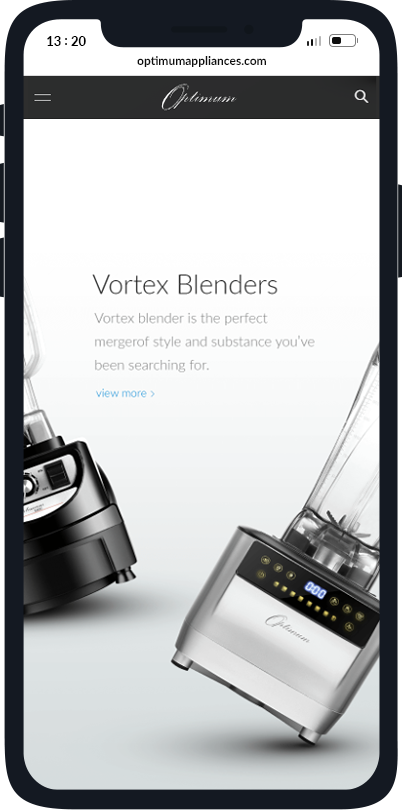
The foundation of the branding are the products. This is why we represented each product on a background derived from the real materials of the product. This made the products stand out incredibly in an environment they naturally belong in. It was just like the world was made for the products rather than the other way around.

Top 3 Things
About the Project
 We realised the need for beauty in the kitchen. It is a special place for every family and high quality products with a premium look made customers feel better.
 Good looking products are purchased much more often than ugly ones. So we were betting that improving the looks will improve sales and it did.
 Additionally good looking products are noticed a lot more which lead to a significant increase in organic purchases from people who “Saw it once and had to have it!”.
The Results
Everything Optimum produces now looks much more appealing. People place their products in visible places in their kitchen essentially showing them off. People even post picutres on Instagram with their new Optimum appliances. This leads to organic traffic, word of mouth and a significant increase in brand engagement and ultimately sales.
of the crown.
-
![]() +37.92 %Brand Search
+37.92 %Brand Search -
![]() +39.73 %conversion rate
+39.73 %conversion rate -
![]() +67.31 %social shares
+67.31 %social shares -
![]() +120.71 %pages per session
+120.71 %pages per session -
![]() +42 %Time on Site
+42 %Time on Site -
![]() +68 %engagement
+68 %engagement -
![]() +173 $Avg. order value
+173 $Avg. order value -
![]() -72.31 %Purchase hesitation
-72.31 %Purchase hesitation -
![]() -34.33 %less bounce rate
-34.33 %less bounce rate
Mario Nafwal
"I was always focusing on making the products better. But I was focusing heavily on performance and features. Before the rebranding I had no idea how huge the impact of branding and design can be on sales. This is probably my highest ROI project so far. I am so happy that I trusted Startup Masters when they proposed this move. "


- Branding & Logo Design
- Wireframing & Prototyping
- Product Presentation
- User Story Composition
- Project Management
- Web Design
- Web Development
- Usability Testing
- Tracking Infrastructure
- Performance Optimization
- Quality Assurance

Learn How We Did it
Join our Masters Academy and learn the secrets of The Digital Performance Marketing.
Learn MoreMore Case Studies
Here are some of the top players we've had the pleasure to have as clients.

 Share
Share 


